Modern Web Design Ideas to Refresh Your Online Presence
A tired website does more damage than many business owners realize. People notice slow pages, cluttered layouts, dated fonts, and awkward mobile navigation within seconds. They may not say, “this site has poor visual hierarchy” or “the interface lacks clarity,” but they feel it. Then they leave.
Refreshing your online presence does not always mean a full rebuild. Sometimes it means making sharper design choices that better match how people browse, compare, and buy right now. The strongest modern sites are not simply prettier. They guide attention, reduce friction, build trust quickly, and make it easy for visitors to act.
That matters whether you run a local service company, a boutique retailer, a growing medical practice, or a regional firm competing against bigger brands. Good web design translates credibility into momentum. It helps the right visitor stay long enough to understand your value.
Modern design starts with restraint, not decoration
One of the biggest mistakes I see is the urge to “modernize” by adding more: more animation, more colors, more overlapping sections, more pop-ups, more trendy effects. In practice, modern web design usually feels cleaner, calmer, and more intentional.
A refreshed site should not fight for attention on every inch of the screen. It should direct attention. That comes from restraint. Generous spacing, fewer competing elements, tighter copy, and a clear visual path often outperform flashy redesigns.
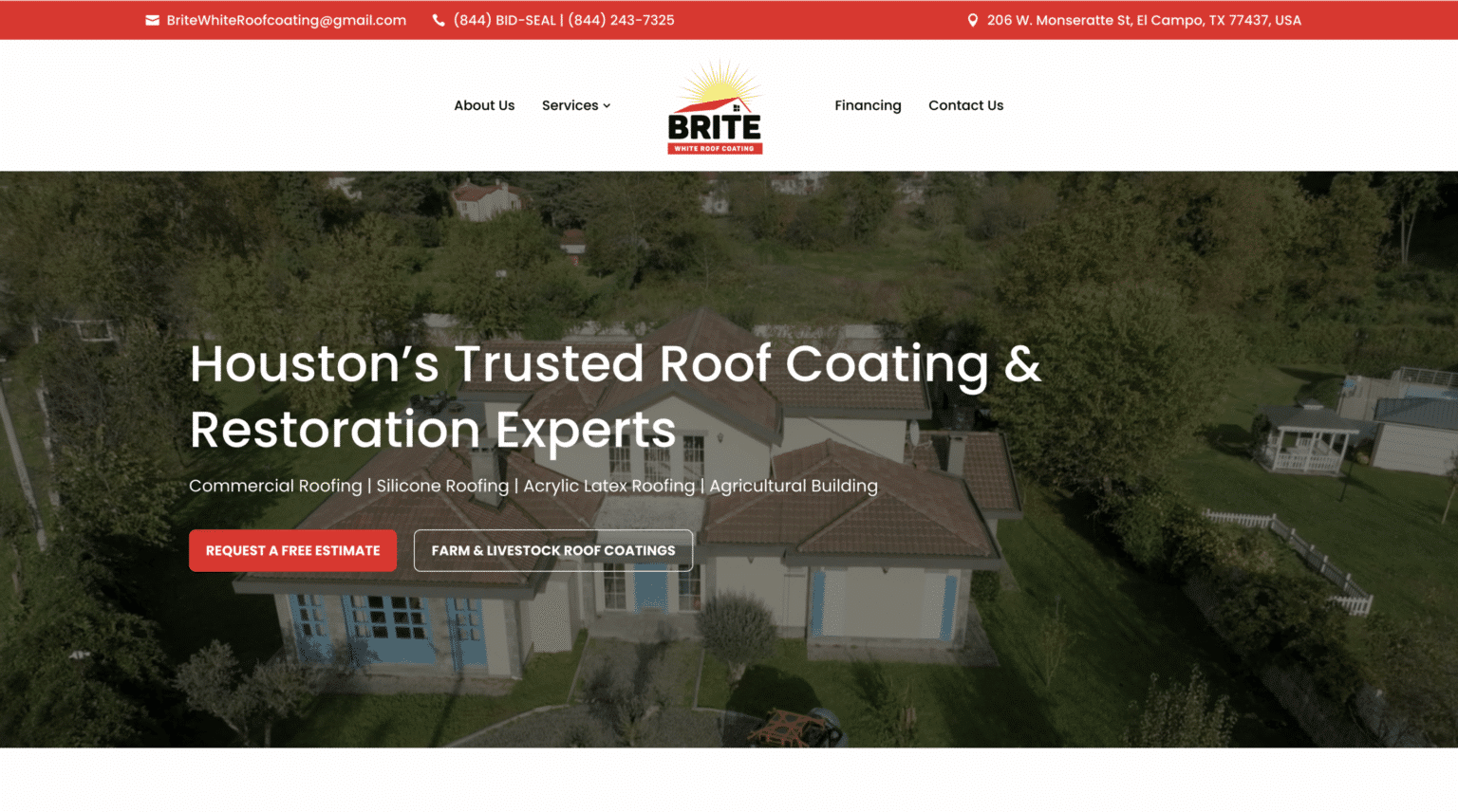
Think about a homepage for a local law office or landscaping company. Visitors usually arrive with a practical question: can this business solve my problem, and can I trust them? If the first screen answers that cleanly, with a strong headline, supporting proof, and one obvious next step, the site is already doing more work than a page full of sliders and decorative effects.
This is especially true in website design for small business. Smaller companies cannot afford to waste attention. Every section needs a job. Every page should help a real person move closer to contact, booking, or purchase.
The first screen needs a stronger point of view
Many websites still open with vague lines like “we deliver excellence” or “your trusted partner for quality solutions.” Those phrases sound polished, but they do not say much. Modern websites perform better when they lead with a clear promise tied to a real need.
A stronger hero section usually includes the business category, the audience, and the result. For example, a generic headline like “Beautiful Outdoor Spaces” may look nice, but “Custom landscape design for busy homeowners who want a yard they actually use” says far more. It narrows the audience in a useful way and positions the service as relevant, not abstract.
This is one of the most practical refreshes you can make because it affects bounce rate, conversion, and brand perception all at once. A visitor should not have to scroll to understand what you do. If they do, the design has already made the copy work harder than necessary.
I have seen small service businesses improve lead quality after nothing more dramatic than clarifying the first screen. Same team, same budget, same traffic, better message. That is not magic. It is alignment.
Mobile design is now the main design
Many businesses still review website mockups on a desktop monitor and treat the mobile version as a technical adjustment. That mindset is outdated. For most local businesses, mobile is the first experience and often the only one.
Modern design decisions should start with the phone screen. That changes priorities. Headlines need to be tighter. Tap targets need space. Menus must be simple. Forms should feel painless. Images need to support the message without pushing key content too far down.
There is also a practical issue many owners overlook: a page can technically be responsive and still feel annoying on mobile. Tiny buttons, sticky chat widgets that cover content, giant image banners, and long walls of text can all make a site feel heavier than it is.
If someone is searching for a roofer, accountant, med spa, or therapist while standing in line or sitting in their car, patience is limited. They want answers fast. The best mobile-first websites respect that reality. They let users call, book, request a quote, or get directions without hunting.
For local markets, including those seeking web design the woodlands, this matters even more. Community-based businesses often win or lose on convenience. A well-designed mobile experience can outperform a bigger competitor’s site simply because it is easier to use.
Visual identity should feel current, not generic
Refreshing a website is a chance to sharpen the look of the brand, but modern identity is not about following every trend. It is about coherence. Fonts, colors, photography, button styles, spacing, icons, and copy tone should all feel like they belong to the same business.
The strongest redesigns usually avoid two extremes. On one side, there is the stale site that has not changed in eight years and still uses cramped layouts and stock photos of people pointing at clipboards. On the other side, there is the trend-chasing site full of dramatic gradients and abstract visuals that could belong to anyone.
The sweet spot is a visual system that feels distinct and usable. A home services business might benefit from sturdy typography, strong contrast, and real project photography. A wellness brand may lean softer and lighter, but still needs structure and readability. A financial firm should not look cold and lifeless, yet it cannot afford to appear casual or vague.
I often advise clients to spend as much attention on image selection as on layout. Real photography, when done well, changes everything. Team portraits, workspace images, completed projects, before-and-after transformations, and location-specific visuals create trust that stock libraries rarely can. Even modest original photography usually beats expensive-looking generic imagery because it proves the business is real.
Speed is part of design, not a separate issue
When people talk about redesigns, they often separate aesthetics from performance. Users do not. A slow site feels less professional, less trustworthy, and more frustrating, no matter how attractive it looks.
Page speed is shaped by design choices. Oversized videos, bloated image files, excessive animation, too many scripts, and cluttered page builders all add drag. A refresh should include design discipline that keeps the site light.
That does not mean every site has to be stripped down and plain. It means effects should justify their cost. If a background video communicates something genuinely useful, maybe it earns its place. If it simply fills space and delays the page, it probably does not.
A practical benchmark many businesses should aim for is a page that feels usable within the first few seconds on a mobile connection. Exact scores can vary by tool and context, but perceived speed is what visitors remember. If text appears quickly, buttons work smoothly, and the page does not jump around while loading, the experience feels solid.
That feeling matters more than most owners expect. Visitors often interpret technical smoothness as business competence.
Better hierarchy creates calmer pages
A common sign of an outdated website is that everything looks equally important. The logo is large, the menu has too many options, there are several bright colors competing for attention, every section has a headline, and every headline is trying to shout.
Modern pages work because they establish hierarchy. The eye should know where to go first, second, and third. Size, contrast, spacing, alignment, and repetition all help accomplish this.
Here are five upgrades that usually improve hierarchy fast:
- Reduce the number of primary menu items so the navigation feels decisive.
- Use one dominant call to action per section instead of several competing buttons.
- Create more whitespace around headlines, forms, and testimonials.
- Limit accent colors to the moments that deserve emphasis.
- Break long pages into clearly defined sections with distinct visual pacing.
These are not cosmetic tweaks. They affect behavior. When a page is easier to scan, people absorb more, hesitate less, and complete more actions. That is why web design is not just an art exercise. It is structured communication.
Trust signals deserve better placement
Many businesses have trust-building content, but they bury it. Awards sit near the footer. Testimonials are tucked onto a separate page. Review scores appear nowhere. Certifications, affiliations, years in business, and recognizable client logos are hidden from the moments where users actually need reassurance.
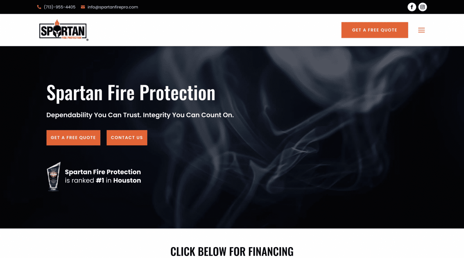
A stronger modern design places proof close to decision points. If a visitor is reading about a service, that is a perfect place to show a review excerpt or a short case result. If someone lands on the contact page, include response expectations, office photos, or a line about how many clients you have helped. If pricing is a concern, use copy and design together to explain value before sticker shock takes over.
This is especially useful in website design for small business because smaller firms often need to bridge an immediate trust gap. Larger brands benefit from recognition alone. Local and growing businesses need the website to do more of that confidence-building work.
I once reviewed a contractor’s website that had excellent customer reviews, years of project photos, and clear warranties, but almost none of it appeared on the homepage. The redesign did not invent credibility. It surfaced it. Leads improved because the site finally displayed what had always been true.
Content blocks should earn their place
A modern website does not need endless sections. In fact, many homepages are too long because they repeat the same point in slightly different packaging. Visitors are forced through bloated storytelling when they really want clarity.
Each content block should answer a real question. What do you do? Who is it for? Why choose you? What does the process look like? What proof do you have? How do I take the next step? If a section does not support one of those jobs, it may be clutter.
This does not mean every page must be short. Some industries need more explanation. Healthcare, legal, financial, and technical services often benefit from depth. The issue is not length alone. It is whether the content is structured with purpose.
Design can help by varying rhythm. Alternate denser sections with simpler ones. Use pull quotes, customer results, concise subheads, and visual breaks. Let the page breathe. People will read more when the design reduces cognitive strain.
Modern calls to action feel specific
“Learn more” and “Submit” still appear far too often. They are familiar, but they are weak. A refreshed site should use calls to action that tell people what happens next.
Specificity improves click confidence. “Book a consultation,” “See recent projects,” “Request a quote,” “Check availability,” or “Talk with our team” are clearer and more persuasive than generic labels. They also help visitors self-select.
That last point matters. Not every visitor is ready for the same commitment. Some want a direct booking option. Others want proof first. Good design provides a primary path for ready buyers and a softer path for cautious researchers.
This is where judgment matters. Too many options create paralysis, but a single aggressive button can alienate colder traffic. The best pages balance decisiveness with flexibility.
Local businesses should design for geography, not just branding
A lot of design advice ignores the realities of local search and regional trust. If your business serves a defined area, the website should make that visible without feeling stuffed with place names.
That can include photography that reflects the community, copy that references service areas naturally, location pages with actual substance, and map-based cues where appropriate. For businesses targeting regional searches such as web design the woodlands, relevance often comes from details that prove familiarity with the market rather than from awkward repetition of a phrase.
Local credibility is usually built through small signals. Mention nearby neighborhoods you serve. Show local project examples. Include office or storefront details. Reference practical realities of the area, whether that means climate, commute patterns, housing styles, or business density. These touches make a website feel grounded, not web design the woodlands interchangeable.
Accessibility improves the experience for everyone
Accessibility still gets treated as an optional feature or a compliance afterthought. That is a mistake. Many accessibility improvements are simply good design.
Readable font sizes, strong contrast, clear labels, keyboard-friendly navigation, descriptive buttons, and predictable layouts all make a website easier to use. They help older users, busy users, distracted users, and users on poor connections, not only those with permanent disabilities.
Modern design should remove friction, not create exclusivity. A sleek site that sacrifices legibility for style may impress the owner and frustrate the customer. I have seen elegant brand systems fall apart because body text was too small, gray on gray, and painful to read on mobile.
Accessibility also protects your investment. A site that is usable across more contexts tends to age better and require fewer corrective changes later.
A refresh does not have to mean starting over
Some websites need a full rebuild. Many do not. If the core platform is stable and the business model has not radically changed, a strategic refresh can go a long way.
The most effective updates often focus on a handful of high-impact areas:
- Rewrite the homepage message so the value proposition is unmistakable.
- Simplify navigation and reduce page clutter.
- Update visual identity elements, especially typography and imagery.
- Improve mobile usability and page speed.
- Rework calls to action and trust signal placement.
That kind of focused work can produce a meaningful shift in perception and performance without months of disruption. It also tends to reveal what deserves a larger rebuild later, based on evidence rather than guesswork.
The best modern websites feel confident
Confidence in web design looks different than many people expect. It is not noise. It is not trend overload. It is not trying to impress every visitor with every possible capability.
Confidence is a homepage that states the offer clearly. It is a layout that gives content room to breathe. It is a mobile experience that works smoothly. It is photography that feels real, proof that appears at the right moment, and a call to action that makes the next step obvious.
If your site feels dated, the answer is not to pile on more features. The answer is to design with more intention. Strong modern web design helps people trust you faster, understand you sooner, and choose you with less hesitation.
That is what a refreshed online presence should do. Not just look new, but work better.
Scalable Websites
Website design for contractors and small businesses
Based in Montgomery, TX, serving Montgomery County and greater Houston
Phone: (832) 979-2478
Website: scalablewebsites.com
Hours: Monday to Friday, 8 AM to 5 PM
Scalable Websites builds and manages mobile-first websites for contractors and small businesses on simple monthly plans, with hosting, security and unlimited updates included. Find us on Google.